Web Product / Audio UI / Front-End
Lunchbox Beat Store
A music web product for producers to preview, organize, and present beats through an audio-first interface.
Role
Product UI Designer, Front-End Builder
Tools
Next.js, React, Figma, audio interface patterns
Focus
Beat preview, catalog browsing, producer-facing presentation
Overview
Turning a beat catalog into a clearer listening and buying experience.
Lunchbox Beat Store is designed around a simple user goal: hear a beat quickly, understand what it is, and decide whether it fits a project. The interface treats audio preview as the primary action instead of hiding it behind a generic product card.
The project combines product UI, audio controls, card-based browsing, and responsive front-end implementation. The result is a small storefront experience that feels direct, organized, and ready for a music producer audience.
Live Site Preview
Open in new tabInterface Details
Designing around the moments where users listen, compare, and choose.
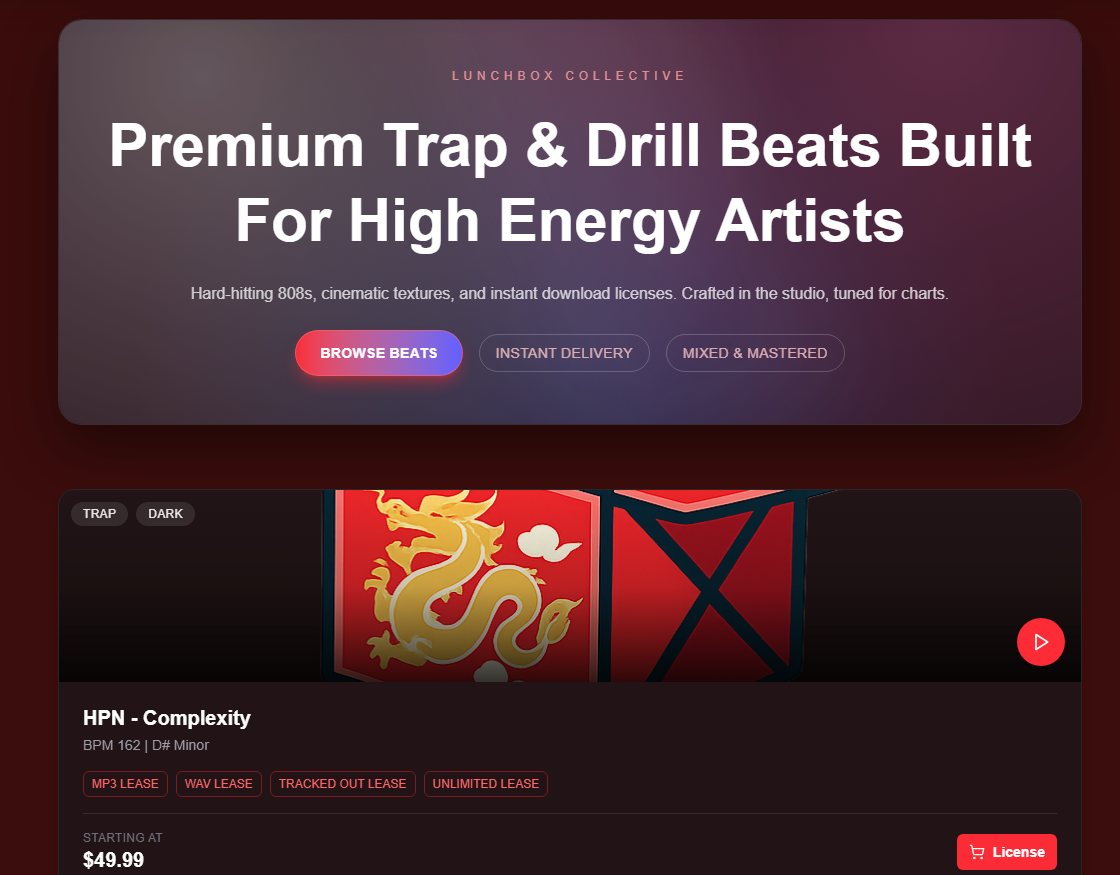
The interface is built from repeated product patterns: a clear navigation bar, beat cards with audio metadata, a persistent player, and a license selector that supports the purchase decision.

Navigation system
A compact top bar keeps Home, Kits, Mixing, About, search, account, and cart actions visible without competing with the beat catalog.
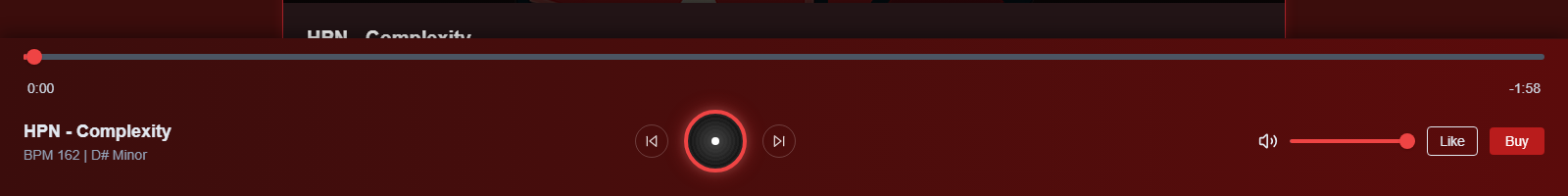
Persistent audio player
Once a beat is previewed, playback controls stay available so the user can keep listening while comparing license options.
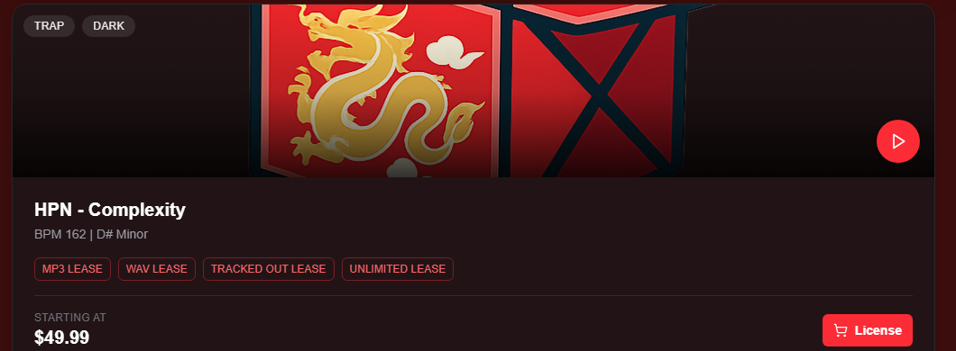
Beat card anatomy
Each card combines genre tags, artwork, play state, BPM/key metadata, license chips, price, and a clear purchase path.
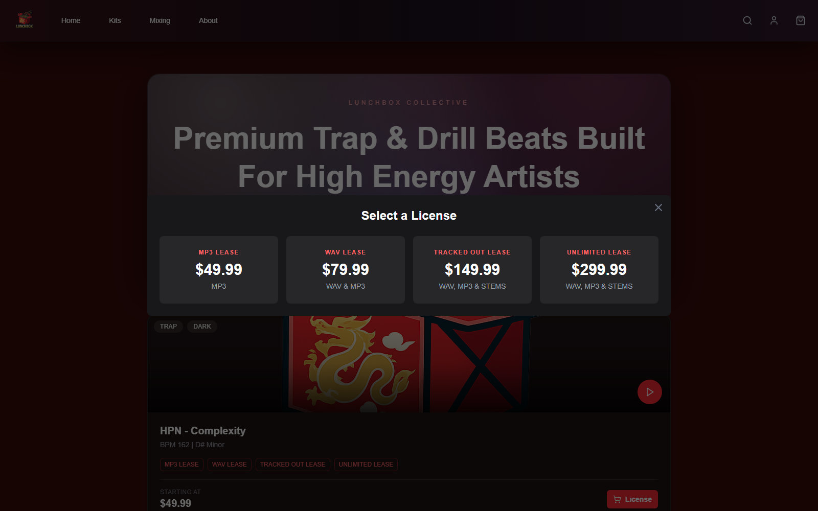
License selection
The license modal separates pricing into four clear tiers so producers can compare file access and usage level quickly.
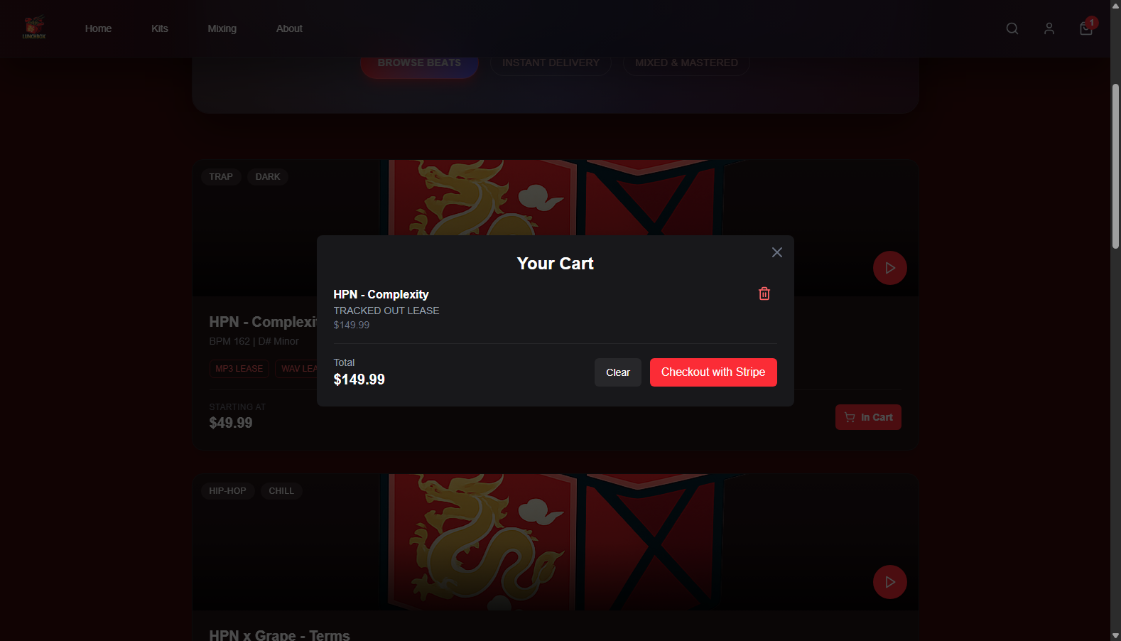
Cart confirmation
After a license is selected, the cart confirms the beat, lease type, total price, and checkout action before the user moves to payment.
Process
Building the store around preview speed, hierarchy, and trust.
I approached the site as a product design problem, not just a visual page. The key question was how to make a beat feel easy to evaluate: what does it sound like, what category is it in, and what action should happen next?
1. Map the buying flow
I treated the site like a small music product: browse beats, preview audio, compare options, then move toward a purchase or contact action.
2. Design the beat card system
Each card needed to communicate track identity, genre/mood, audio state, and action hierarchy without becoming visually noisy.
3. Prototype the audio UI
The core interaction was previewing beats. I focused on making play controls, waveform visuals, and active states feel immediate and readable.
4. Build and refine the front end
The final site was shaped through responsive layout, spacing passes, button hierarchy, and visual polish for a more product-ready presentation.
Early structure focused on the relationship between storefront messaging, beat cards, and repeatable preview actions.
Beat discovery
A storefront structure helps producers present tracks through cover art, tags, price cues, and clear browsing states.
Audio-first preview
The interface prioritizes play controls, waveform rhythm, and fast preview behavior so users can evaluate beats quickly.
Organized catalog
Cards, filters, and repeated metadata make the beat library easier to scan without overloading the page.
Responsive product UI
The layout adapts from a polished desktop storefront to a compact mobile buying and listening flow.
Skills Used
Result
The final product presents beat browsing as a focused interaction: choose a track, preview it quickly, understand the metadata, and move toward the next action without losing context.
Open live website